 Recently, I had the good fortune of hearing Kelly Leonard speak about boosting your LinkedIn profile. Kelly is a speaker and trainer, and an expert in LinkedIn strategy. I was glad to hear her speak because LinkedIn has always been a bit of a mystery: it’s a social platform, yes, but geared toward sharing professional accomplishments and making professional connections. Many use it to research job opportunities, find prospects, and to stay abreast of industry news. Thus, it’s not a place to complain about lousy service or post pictures from your weekend. Posting to LinkedIn requires finesse.
At the eWomen’s Network Luncheon in April, Kelly was offering five minute LinkedIn profile reviews. During our session, Kelly offered five recommendations to improve my profile to make it more findable, scannable, and appealing on LinkedIn. They included:
- Banner
- Profile picture
- Short description
- Location
- Summary
Let’s go through them together:
1. Make your banner a graphic that shows what you do.
Your banner image is often a user’s first impression of you. It’s at the top of your profile page, and can be informative and evocative or confusing and unclear. Use the banner image to show users what you do without making them read your profile. This can be accomplished by incorporating your logo into your banner, or by putting keywords or a tagline on the banner.
Tool: the specs for a LinkedIn banner image are ?x?. Remember that a portion of the banner will be cut off by the top of your profile. Download a template for a LinkedIn banner image here.
2. Choose a picture that looks confident, likable, and influential.
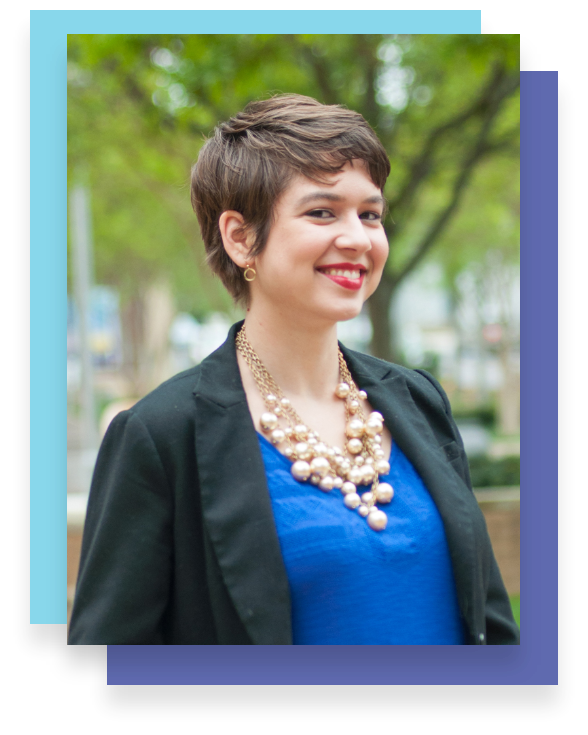
While a picture of you socializing works fine for your personal Facebook profile, the tone of LinkedIn is professional. A picture is worth a thousand words: after your banner image, your profile picture is the first thing users will see. Make a good first impression! Consider eye contact, smile, lighting, and how zoomed in or out the picture is. Avoid anything blurry, cropped, or overly casual.
Tool: Kelly recommended Photofeeler for choosing an image, and it’s incredibly helpful. It allows you to upload several picture options and have them rated by other users for confidence, likability, and influence. In turn, Photofeeler asks you to rate pictures of others for the same characteristics.
3. Include keywords in your short description.
There are many jobs titles out there that do not convey what responsibilities the job entails. For example, what do “Fulfillment analyst,” “Digital strategist,” or “Communications Coordinator” actually mean? Rather than using the short description by your picture to share your job title and company name, consider using keywords that will help other users find you. Do you manage web analytics data? Do you manage social media platforms? How many years of experience do you have? Are you a speaker or educator? On what topics? Saying you’re the Founder of XYZ Company (as I did!) isn’t as helpful for the user. But describing what you specialize in is.
4. Choose a recognizable location.
This one is pretty intuitive: if you live in or around a large metropolitan city, make that your location, rather than where you actually live/have your office. Most of us scan and make quick judgments–that’s why including keywords in your banner image and short descriptions are so helpful. And it’s best to go with a recognizable location rather than an obscure one.
5. Write a detailed summary.
If someone decides to take the time to read your summary, make it worth their while. Kelly recommends three paragraphs with a CTA at the end. Your CTA could be a link to download a lead magnet on your website, watch a video, follow you on social, or read your latest article.
As for your paragraphs, go into some detail about your work history, and don’t be shy about name dropping. Like keywords and big cities, recognizable brands or businesses that you’ve worked with will help your user form a favorable impression of your experience.
Ready for the transformation?
Before:
After:
Does optimizing your LinkedIn profile feel contrived? Like any form of presentation, from clothes to word choice to your website, your LinkedIn profile will serve you better when it has been well designed. It’s is like a social media version of your resume – it is a place where you want to make your best, most professional, most accomplished version of yourself available. As Kelly said in April, “it doesn’t change who you are, it amplifies who you are.”
