Welcome to Medusa Media’s resource for how to make your thought leadership (particularly on LinkedIn) accessible for people with low vision and blindness. This article focuses on best practices for providing “alt text”, an important component of images that screen readers can parse.
This article is long, informative, and a living document. As we learn and technology evolves, we’ll edit this resource so it’s as helpful and accurate as possible.
It starts with a short story (content warning: the story discloses my own ableism. Please skip if reading about ableism will cause harm). Then we go over what alt text is and why it matters, best practices, and examples from LinkedIn. You can use this table of contents to go directly to the section that will be most valuable to you:
- Recognizing My Own Ableism (story)
- Why Image Alt Text Matters
- What is Alt Text? And Best Practices (Dos and Don’ts)
- Check in: How do you feel?
- Medusa’s Alt Text Practices and Scope
- Use Alt Text for Every Image
- Frequently Asked Questions
Thank you for being here. Accessibility and inclusion are important yet often neglected, which is hurtful and limiting. While this is not an exhaustive resource, I hope it piques your curiosity, educates you, and equips you to make your thought leadership more accessible.
If you have feedback that would improve this resource, please email me: evaj @ medusamediagroup . com.
If you’d like to spread the word about accessibility, thank you! Here’s a social media post you can share, so your audience can use this resource too:
Share “Make your Thought Leadership More Accessible”:
Copy this text, and paste it into a post on LinkedIn or other social:
Do you provide alt text for your content on social media?
If not, you’re missing a critical step in making your content accessible to and inclusive of people who use assistive technologies.
Not including those individuals isn’t only ableist, it also limits your audience… by the millions!
Learn what alt text is, why it matters, and how to include it in all your social media, emails, and articles going forward: https://medusamediagroup.com/thought-leadership/make-your-thought-leadership-accessible-with-alt-text/ by @Eva Jannotta
Recognizing My Own Ableism
If we’ve not met before, hello! I’m Eva Jannotta, I use she/her pronouns, and I live on O’odham Jeweḍ, Akimel O’odham, and Hohokam unceded indigenous land. I’m a thought leader advisor and trainer, the founder of Medusa Media Group, and I don’t love to admit this, but: I’m ableist. I’ve learned that I’m especially ableist when ableism seems more convenient than practicing inclusion. Ugh and yuck.
Recognizing my ableism, especially in the context of thought leadership, started when I saw a tweet with this tip: “capitalize the first letter of words in your hashtags. It makes them easier for screen readers to read” (thank you Christy Batta for sharing!).
Ever since, my team at Medusa Media and I have always capitalized the hashtags we provide our thought leader clients and use ourselves. Why wouldn’t we!? It’s an easy way to make social media posts more accessible to blind and visually impaired people.
Yet not long after that, I learned that providing image alt text is another important way to improve online accessibility for the blind and visually impaired. Despite learning about the importance of image alt text years ago, I didn’t make it a priority for Medusa Media Group.
Why? Honestly, it “seemed inconvenient.” I didn’t know how, it wasn’t something I could do quickly (whereas capitalizing hashtags was), and so I ignored it. I blithely went along in my vision-privilege, until a prospective client asked, “how do you make sure your social media is accessible? Do you capitalize hashtags and provide image alt text?”
*Gulp*
Clarity hit like a bell: by not adding alt text to all the social media we create, I’d been consciously ableist for years. Yuck, but it’s true: What else explains why I refused to take action on image alt text even though I knew it improved accessibility?
It’s ugly to admit, but the reality is that I decided my convenience was a greater priority than inclusion.
Those days are over. In this lengthy piece, I’m sharing Medusa Media Group’s practices and guidelines for including image alt text on all the social media we provide our clients and ourselves, as well as how we teach inclusive social media in our group programs.
(Note: we’re a small team, and implementing these practices is taking time. Depending on when you read this, you may find alt text still missing from some of our content. If you do, please reach out and let me know so we can fix it!)
Why Image Alt Text Matters for Accessibility
Providing image alt text for imagery used in thought leadership articles, emails, and social media posts matters because of accessibility.
“If someone went on your website or profile with their eyes closed, would they still be able to find their way around? By adding alt text and image descriptions, barriers are lifted and more people can access your content.”
Veronica Lewis (source 1)
If you don’t provide an alternative textual description of your imagery, there’s a gaping hole in your content — a hole that would be difficult (impossible?) to bridge for someone using assistive technology like a screen reader.
There are other reasons why providing alt text is valuable:
- Ensure your visual content is accessible to people using screen readers (I consider this the most important reason!)
- If an image doesn’t load on someone’s device, alt text will display instead which will give the reader an understanding of the missing image’s purpose
- Search engines index alt text, which can bolster SEO results
Providing image alt text makes sure that anyone using a screen reader can experience the images that accompany your thought leadership and other content.
Also: Why would you Consciously Limit your Audience?
Up to one in four adults have a disability in the United States (source 2). Over 13 million adults in the United States have “vision disability with blindness or serious difficulty seeing even when wearing glasses” (source 2).
To put it plainly: If you’re not providing image alt text for the pictures you share in your thought leadership and on social media, you are limiting your audience. You are making it very difficult (or impossible) for millions of people to access your work and feel welcomed by it.
Why would you limit your audience like that?
Alt Text: What It Is? And Best Practices
“Alt text” is when you use words to describe what an image depicts, and either embed that text as part of the image (websites offer this capability, and LinkedIn does in some cases) or include it in post text on social media.
When someone uses a screen reader to navigate a page with multiple images, the screen reader can’t “see” the images. But it can tell an image is there and it can read the image’s attributes. When one of those attributes is alt text, the screen reader can read the text and allow the person navigating to understand the image’s function.
The purpose of alt text is not to describe in minute detail every single aspect of the image, but to give the person navigating clarity on:
- What the image depicts, and
- What purpose the image serves
That being the case, image alt text works best when it’s short. Its intended to convey the purpose of the image:
“A picture may be worth a thousand words, but there’s no reason to write them all out and leave the user waiting for the descriptions to end.”
Veronica Lewis (source 1)
DO — The most effective alt text will have the following attributes:
- Short. Be specific and succinct — 150-300 characters is ideal
- Informational. Describe visual information, not aesthetics.
- Picture an image that depicts Nike’s logo. The alt text should say, “Nike company logo” rather than “graphic of a swooshy check-mark”
- If an image is aesthetic only, put “null” or empty quote marks (“”) in place of alt text so the person knows the alt text isn’t missing, but is unnecessary.
- Punctuation. Use normal punctuation
- Text. Include any relevant text on the image.
- If your image depicts a book cover or event flier, make sure to include those details in the alt text.
- Purpose. Convey the context and function of the image (what does the picture do?)
- Holly Tuke points out that the function of an image depends on context. Picture an image of a well-decorated room. If you’re an interior designer, your alt text may include design features. But if you’re a leadership coach sharing an image of a nice-looking room with a laptop in it, see #3 below.
- “A maple leaf might represent Canada, or it might just illustrate the leaf of a tree.” (source 3)
- Complexity how-to. For complex images, provide further explanations elsewhere, such as for complex infographics, text-heavy drawings, or a screenshot heavy with text. This is a great example, by Yi Shun Lai (found via Coty Craven, source 4).
Are you feeling overwhelmed? Confused? Not sure how to proceed? Think about it this way:
“Think about how you would describe the image to someone over the phone.”
– Holly Tuke (source 5)
DON’T — Alt-text pitfalls to avoid:
- Don’t start alt-text with the words “a photo of…” or “an image of” because it’s obvious to the screen reader that it’s an image. Don’t waste characters!
- Don’t include copyright information or photo credits in alt-text (again, not the point!)
- Leave out alt-text for images that are only decorative, like in the leadership-coach-laptop example above. Another example might be a picture of a sunset or smooth pebble in a mindfulness article. Ask yourself, “without this image, does what I’m saying still make sense?” If yes, then you’re likely working with a decorative image.
- See #2b above for what to do instead.
- See #2b above for what to do instead.
Check in: How Do You Feel?
Take a deep breath and check in with your body. What do you feel?
When I learn about something new, especially if it seems to require a lot of steps and adjustment and refinement to implement, I often feel my body get tight. My shoulders creep up to my ears. My breathing is more shallow. I might be gripping my toes or fingers, frowning, or otherwise holding tension.
If I were to give these physical sensations some labels, I’d use words like “overwhelmed,” “intimidated,” and, since we’re talking about accessibility, “guilty” (I feel remorse for how long it’s taken me to commit to accessibility).
If you can relate to the above, you’re not alone, there’s nothing wrong with you, and you/we can do this. In the next section, I’m going to share the process Medusa Media Group uses to provide alt text for our clients. Then in the final section, I’ll show examples of adding alt text to your thought leadership, particularly to LinkedIn and social media posts (as of this writing, it requires some extra “doing” to implement alt text on social).
Medusa’s Image Alt Text Practices and Scope
There is a ton of valuable and in-depth information out there about making different types of media more accessible, and providing alt text in mediums like power points, word documents, PDFs, videos and more.
In our work, we train and advise clients on distributing their thought leadership through:
- Long-form written pieces
- Emails to their list, and
- Social media, particularly LinkedIn.
All three of these modes of distribution can and often do include imagery, especially on social media. That being the case, our practices and guidelines for providing image alt text focus on these modes, and therefore are not exhaustive! I’ll provide additional resources at the end.
Use Alt Text for Every Image
The big, bad takeaway from this entire lengthy blog article is: use alt text for every image you share on social media. Full stop.
That means:
- Articles: When you’re writing an article, for your own website or another publication, write alt text for the images included in the article
- Emails: When you’re sending an email to your list, write alt text for your logo, header image, podcast images, or any pictures you include before you press send
- Social Media: when you’re publishing a post to social, whether in real time or using a scheduling tool (we use Meet Edgar), write alt text for the image, link preview, or GIF. If you’re sharing a video, make sure it has captions.
Fortunately, most email service providers (ESPs) and customer relationship management (CRM) software provide a field for alt text in every image. Here’s an example from Mailchimp:
How to Provide Alt Text on LinkedIn
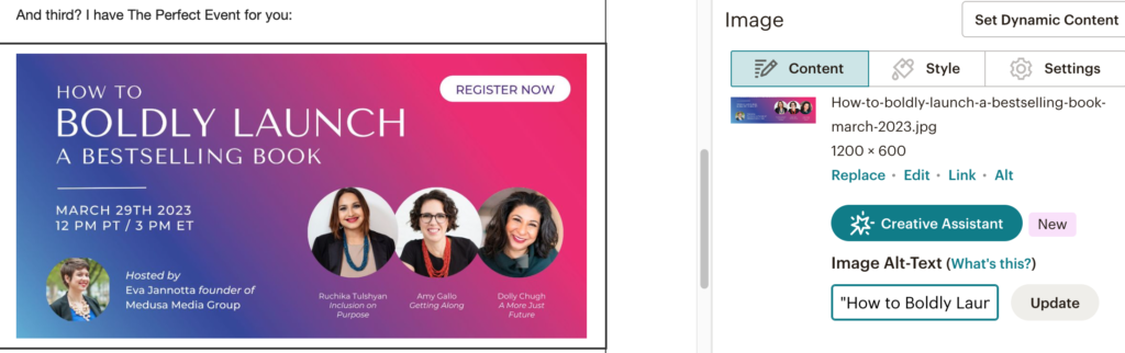
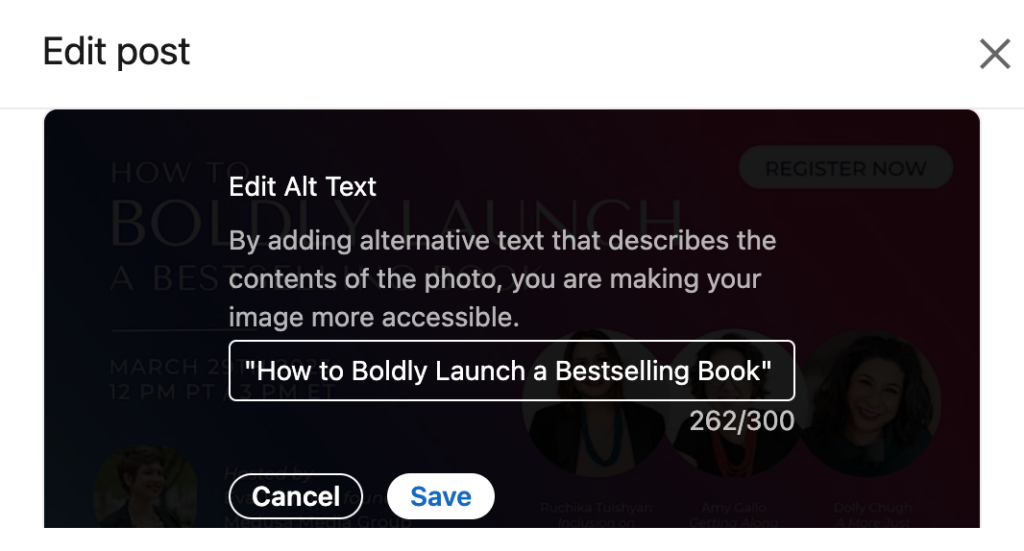
Unfortunately, social media doesn’t always make it that easy. As of 2023 on LinkedIn, only certain types of posts provide an alt text field, and that’s image posts. Here’s an example of a image post and the alt text field it provides:
But another frequent post-type on LinkedIn is link preview posts — that is, when you paste a link into the post box, and a link preview automatically loads. Here’s an example with an eventbrite link:
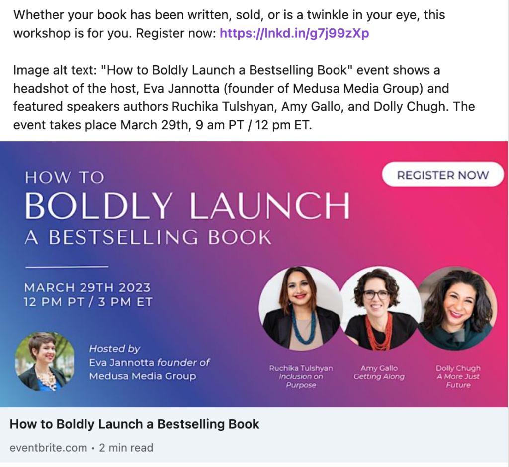
There’s no option to add image alt text to that link preview. And while the link’s website may (or may not) provide alt text, someone navigating LinkedIn with a screen reader would have no way of knowing what the link preview image depicts.
How to Provide Alt Text using a Social Media Scheduling Tool
Also unfortunately, scheduling tools (as of 2023) do not provide an alt text field for posts you want to schedule in advance. I hope this changes, but for now the best work-around I know of is to manually add alt text to the scheduled post (see the eventbrite link example above for what that looks like).
If it’s an image post, you can edit the post after it publishes, and move the alt text from the post itself to the image’s alt text field (note: you can only edit a post to add alt text later if it has only one image. If there are multiple images, you must add alt text to each image individually before you publish it. There’s no way to add alt text after it’s published if there’s more than one image).
If it’s a link preview post, the best option I’m aware of is to keep the image alt text in the post itself, so people with screen readers a) can understand what the link preview depicts and b) know you aren’t neglecting their needs and accessibility.
A case for always keeping alt text in the post:
Medusa’s practice at first was to put all alt text in the body of the post in Meet Edgar, our social media scheduler. Then, when the post went live on a clients’ LinkedIn, we would manually add the alt text to the image (if it was an image post), and leave it in the body if it was a link preview post.
But then I came across this post from Meryl Evans, which makes the case for keeping alt text in the body of the post always. This is more accessible for deafblind people and people using text-to-speech.
This discovery is a case-in-point reminder that accessibility is an evolving work in progress for everyone!
Do GIFs and Emojis need alt text on social media?
Employ alt text for GIFs the same way you would for images: by describing, briefly, what the GIF depicts depending on its purpose.
You do not need to provide alt text for emojis, but be mindful of not using too many emojis in a row, or repeating emojis (the screen reader will read out each emoji. How annoying would it be to listen to “champagne bottle, champagne bottle, champagne bottle” ten times?). Also: “Avoid conveying critical information with emoji” – Veronica Lewis (source 6).
Frequently Asked Questions about Alt Text and Accessibility
I’m not an expert on accessibility. If you are, you might find that I’ve made errors (and if you do, and you’re willing to give me feedback, please email me at evaj @ medusamedia group . com). The Medusa Media team is learning as we go, and these are some of the questions we have about providing alt text.
I’m grateful to our client Dolly Chugh (she/her), who generously introduced me to Coty Craven (they/them). Coty is an inclusive community builder and expert, writer, producer, and video game producer. I’m extremely grateful to Coty, who provided answers to my questions and consented to let me quote them. Thank you, Coty! They offer terrific accessibility resources to writers in particular, which I’ve linked below (see source 4).
Q: how do you determine if an image is “informative” or “aesthetic?
It’s recommended to provide alt text for “informative” imagery, not purely “aesthetic” (like a picture of a pebble in an article about mindfulness) images. But say you’re scrolling LinkedIn, and you come across a post about mindfulness with a link preview of an image of a pebble. The pebble is aesthetic, but without providing alt text viewers with screen readers will still feel left out, or be left to wonder “did they just skip alt text? Or do I really not need to know what that image depicts to understand the content?”
“For aesthetic vs informative, I would say to always include a few words of alt text regardless of the purpose. So just “A pebble” would suffice. Because people using screen readers will have the file name read to them if the alt text field is left blank in some instances and sometimes think the person did just skip it entirely.
A good way to tell the difference is in how you’re thinking of using the image. If you’re writing a blog post with screenshots that lend themselves to the content in a meaningful way, those would get a better description of how/why they’re included. If it’s just to break up content, short is better. For example, when I wrote accessibility reviews of video games, I’d include a title image with alt “Legend of Zelda press art.” I’d also include screenshots of the game’s subtitles which were an important part of my article, so I’d describe what the subtitles looked like in the image because that was why I shared the image.”
– Coty Craven
Q: How do you avoid making identity assumptions about people depicted in an image?
If an image depicts a woman wearing a scarf over her hair, the alt text could read “Muslim woman,” “woman wearing hijab,” or “woman wearing a scarf.” Each has a different meaning and is making a different assumption. Another example: describing someone as a “Black woman” can mean a ton of different skin tones, hair styles, and more. No group is a monolith.
You touch on this in your presentation, and you point out how important it is not to describe people only from historically underestimated backgrounds. But I’m still curious about the assumptions we make when we interpret an image. Thoughts?
“Making assumptions can be tricky because it relies on prior knowledge and cultural literacy. I caution assumptions more for gender and ethnicity. For example people who know me or have looked me up on social channels would not assign she/her pronouns to me in alt text. But people that don’t know me or hadn’t done their research would be more likely to misgender me in alt text.
Same for ethnicity. People describe “an Indian man” when the man is Pakistani, “an Arab woman” when the woman is Persian, etc. For things like hijabs and headscarves, that’s where research and cultural literacy come in, knowing different styles of cultural head coverings. For skin tones, I’ve taken the lead of BIPOC in writing alt text and many will describe the shade. “A dark skinned Black woman,” “A brown skinned Muslim man,” “A pale white androgynous person.””
– Coty Craven
The conclusion I’ve come to is that it depends on context: when you’re writing alt text for an image of someone you know, make sure to identify them using their words. But if your image is of, say a woman-presenting person on a laptop, and you work with women entrepreneurs, I’d venture that it’s appropriate to describe the picture using she/her pronouns.
Q: Why do some resources recommend using alt text and image descriptions?
(This question addresses the option to provide image alt text AND to provide image descriptions. I didn’t go into detail about image descriptions in this resource, but there are lots of places you can learn about it.)
I understand the recommendation to be concise and specific in alt text. But some images require much more description to be meaningful, especially screenshots heavy with text, or infographics. But with a social media post, I can imagine a thorough image description could end up being longer than the post text itself. When are image descriptions necessary vs when alt text is sufficient?
“With image descriptions vs alt text, you generally only run the risk of them being too long if the image contains a lot of text. Most screen reader users set the speech speed to 2-3x “normal” speech speed, so it doesn’t take nearly as long as we’d think to get through a paragraph. But a good rule is to try and stay under 300 characters (Twitter’s 1000 characters allowance is WAY too long).”
– Coty Craven
Q: What if people (colleagues, bosses, peers) think my alt text looks weird or strange?
They might! As Medusa has begun implementing alt text, I received feedback from one person who said it looked “unprofessional.”
While unpacking “professionalism” is its own conversation, I bet we can agree that, at first, alt text in a social media post looks at least unfamiliar. While I’ve seen a handful of people (For example, Emily Weltman: this post shows alt text for multiple images in the comments!) using alt text in their LinkedIn posts, it’s far from common.
Adding alt text to your social posts may indeed cause confusion and uncertainty at first — and each instance of that is an opportunity for leadership. You can explain why you provide alt text, what it is and how it works. Every time you do, more people will understand why it matters.
It’s my hope that, as the years go on, seeing alt text on social media will be about as remarkable as an emoji or hashtag — that is, not at all.
Connect with Medusa Media
Thank you for reading this long resource! For about accessibility and inclusion at Medusa, see Why We Offer “Equity Pricing” In Our Programs For Thought Leaders and our Anti-Racism Commitments.
Want to connect further? We’d love to have you join our email community. We share our freshest thought leadership, best stories, and opportunities to connect every week for free. Our readers say…
- “This analysis is super helpful. Thank you!!” E.H.
- “So fascinating and mindset shifting. And it bears repeating, for sure!” – D.C.
- “I loved the email that you sent yesterday about putting back out the same content – I applied it immediately :-)” – A.D.
Resources and Further Reading
- Source 1: How to Write Alt Text and Image Descriptions for the visually impaired, by Veronica Lewis
- Source 2: Disability Impacts All of Us, by the Centers for Disease Control and Prevention
- Source 3: Alternative Text by WebAIM
- Source 4: Accessibility for Writers, by Coty Craven
- Source 5: Common alt-text mistakes that hinder image accessibility by Holly Tuke
- Source 6: Texting Etiquette for Low Vision by Veronica Lewis
Veronica Lewis’ site, Veronica With Four Eyes, also has great resources.